

To evaluate how well the clustering worked, we can calculate the silhouette score, which is a measure of how similar an object is to its own cluster compared to other clusters. The silhouette score ranges from -1 (a poor clustering) to +1 (a very dense clustering), with 0 indicating the overlap of clusters. Here is how you do it:
from sklearn.metrics import silhouette_score

# Compute the mean silhouette coefficient
score = silhouette_score(X_features, labels)

print('Silhouette Score: ', score)
Out:
Silhouette Score: 0.3070628129136107
We can also assess the quality of our clustering with visualization. We'll define two functions: silhouettleViz to calculate and visualize silhouette scores and clusterScatter to visualize the shape and separation of our clusters.
from sklearn.metrics import silhouette_samples
from matplotlib import cm

# Function to visualize silhouette scores
def silhouetteViz(num_clusters, X_features):
    kmeans = KMeans(n_clusters=num_clusters, random_state=0)
    y_labels = kmeans.fit_predict(X_features)

    silhouette_values = silhouette_samples(X_features, y_labels, metric='euclidean')

    y_ticks = []
    y_lower, y_upper = 0, 0
    for i, cluster in enumerate(np.unique(y_labels)):
        cluster_silhouette_values = silhouette_values[y_labels == cluster]
        cluster_silhouette_values.sort()
        y_upper += len(cluster_silhouette_values)
        plt.barh(range(y_lower, y_upper), cluster_silhouette_values, edgecolor='none', height=1)
        plt.text(-0.03, (y_lower + y_upper) / 2, str(i + 1))
        y_lower += len(cluster_silhouette_values)

    avg_score = np.mean(silhouette_values)
    plt.axvline(avg_score, linestyle='--', linewidth=2, color='green')
    plt.title(f'Silhouette plot: {num_clusters} clusters, avg score: {avg_score:.3f}')
    plt.xlabel('Silhouette coefficient')
    plt.ylabel('Cluster')
    plt.show()

# Function to visualize clusters
def clusterScatter(num_clusters, X_features):
    c_colors = []
    kmeans = KMeans(n_clusters=num_clusters, random_state=0)
    y_labels = kmeans.fit_predict(X_features)

    for i in range(kmeans.n_clusters):
        c_color = cm.jet(float(i) / num_clusters)
        c_colors.append(c_color)
        plt.scatter(X_features[y_labels == i, 0], X_features[y_labels == i, 1], marker='o', color=c_color, edgecolor='black', s=50, label='cluster'+str(i))

    plt.scatter(kmeans.cluster_centers_[:, 0], kmeans.cluster_centers_[:, 1], marker='*', c='red', s=250)
    plt.title(f'Cluster scatter: {num_clusters} clusters')
    plt.legend()
    plt.grid()
    plt.show()
We can use these functions to analyze the quality of the clustering for different numbers of clusters. You'll need to call each function once for each number of clusters you want to visualize, let's say we want it to be from 3 to 6.
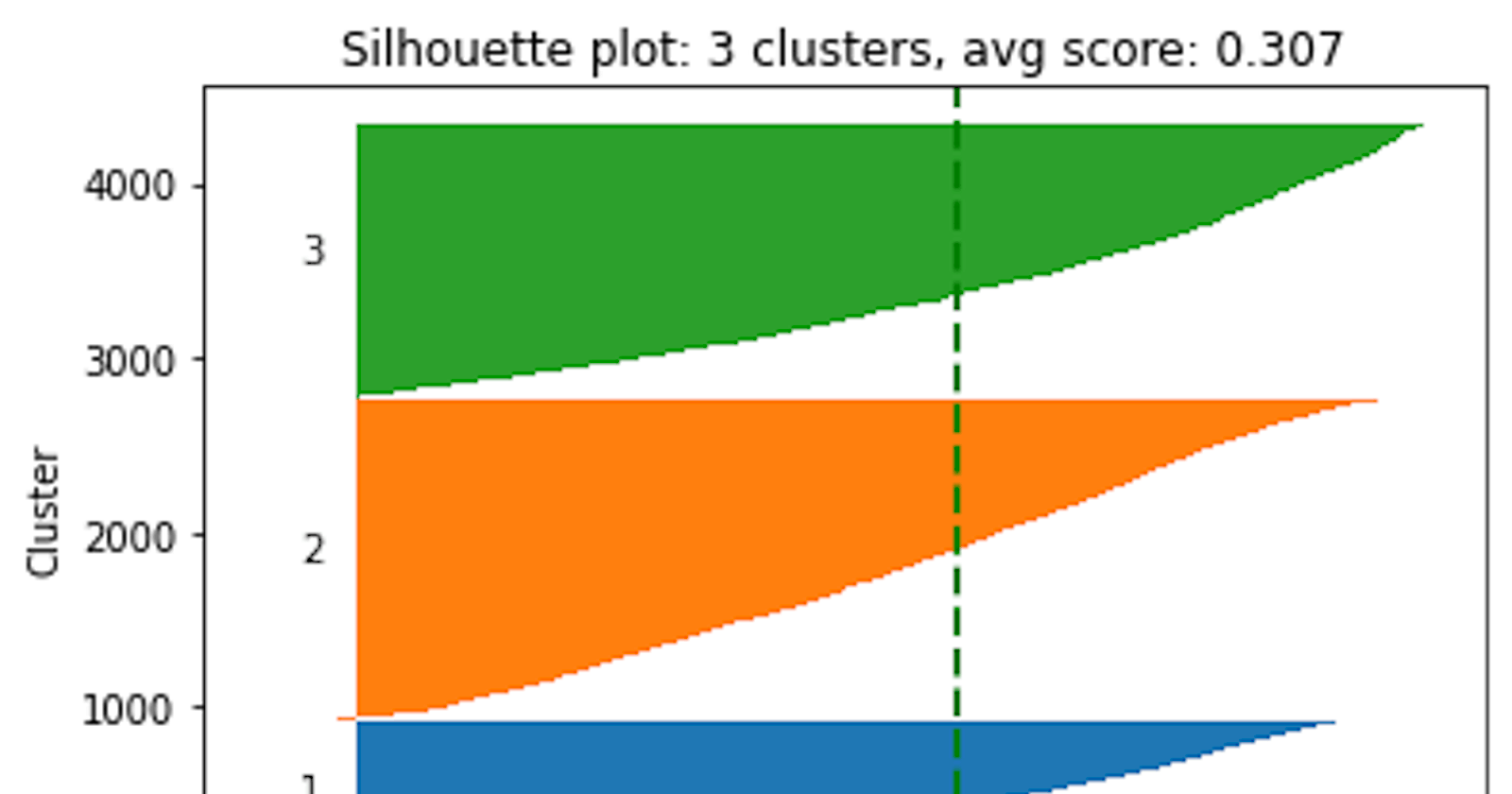
# Create the silhouette plot and cluster scatter plot for 3 clusters
silhouetteViz(3, X_features)
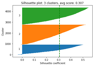
clusterScatter(3, X_features)
Out:
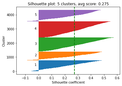
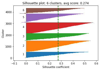
Silhouette Plot: This graph provides a way to evaluate the quality of clustering performed by the K-Means algorithm. Each "knife-ish" shape represents one cluster. The length of these shapes shows the number of data points in each cluster. The width (or height on the y-axis) represents the silhouette coefficient, a measure of how close each point in one cluster is to the points in the neighboring clusters.
This coefficient ranges from -1 to +1. The higher the silhouette score, the better the clustering because it means data points are well grouped. The green vertical line you see is the average silhouette coefficient for all data points, providing a summary measure of the quality of clustering.
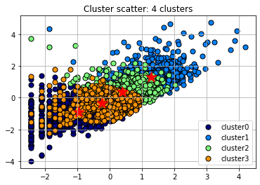
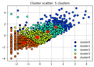
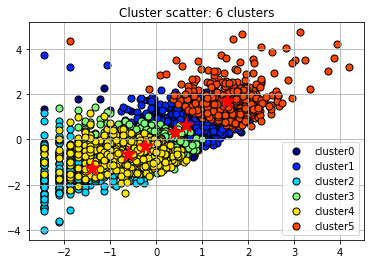
Scatter Plot with Cluster Centroids: This is a visual representation of the clusters formed by the K-means algorithm. Each color represents a different cluster. The "paintballs" are the individual data points colored based on their cluster assignment, and the markers are the centroids of each cluster. These centroids are essentially an average of all the data points in the cluster. The K-means algorithm tries to minimize the distance between each data point and the centroid of the cluster it belongs to.
In this scatter plot, it's common to observe that data points belonging to the same cluster are closer to each other and farther from data points from other clusters. However, there often might be overlap between clusters. The centroids' position gives an intuition about where the middle of each cluster lies in the feature space.
Both plots are based on the current clustering, so they'll change if we decide to modify the number of clusters or re-run the K-means algorithm with a different random initialization.
# Call the visualization functions for different numbers of clusters
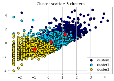
for i in range(4, 7):
silhouetteViz(i, X_features.values)
clusterScatter(i, X_features.values)
plt.show()
Out:
After visualizing the silhouette scores and the clusters, you can decide to change the number of clusters based on the visualization and silhouette scores and refit the KMeans model, but it's not a must. If you are satisfied with the initial clustering result, you don't need to change the number of clusters.
The silhouette score for 4 clusters is nearly identical to the score for 3 clusters, indicating that both provide a comparable quality of clustering. But to demonstrate re-evaluating and refitting the model, we'll assume that 4 is now the optimal number of clusters (adding +1 the 'ElapsedDays' values before normalizing the distribution results in 0.303 and 0.309 silhouette scores for 3 and 4 clusters respectively).
# we'll assume that 4 is now the optimal number of clusters
num_clusters = 4

# initialize KMeans with the chosen number of clusters
kmeans = KMeans(n_clusters=num_clusters, init='k-means++', max_iter=300, n_init=10, random_state=0)

# fit the model to the data
labels = kmeans.fit_predict(X_features)

# Add the cluster labels for each data point to the dataframe
customer_df['ClusterLabel'] = labels
customer_df.head()
Out:
| CustomerID | Freq | SaleAmount | ElapsedDays | Freq_log | SaleAmount_log | ElapsedDays_log | ClusterLabel | |
| 0 | 12346 | 1 | 77183.60 | 325 | 0.693147 | 11.253955 | 5.786897 | 2 |
| 1 | 12347 | 182 | 4310.00 | 1 | 5.209486 | 8.368925 | 0.693147 | 1 |
| 2 | 12348 | 31 | 1797.24 | 74 | 3.465736 | 7.494564 | 4.317488 | 2 |
| 3 | 12349 | 73 | 1757.55 | 18 | 4.304065 | 7.472245 | 2.944439 | 2 |
| 4 | 12350 | 17 | 334.40 | 309 | 2.890372 | 5.815324 | 5.736572 | 0 |
But keep in mind that the silhouette score is just one measure of cluster quality, and it might not always align perfectly with the real-world meaning and usefulness of the clusters.