

We've now completed the data preprocessing and transformation stage.
Data visualization is an excellent way to understand the properties and trends of your dataset. While it's not strictly necessary if you already have a good understanding of the data, it's often a good practice to include visualization as part of the exploratory data analysis (EDA) or confirmatory analysis. The goal of visualization is to understand the data better and make informed decisions in analysis or modeling than just to create nice-looking graphs.
There are many types of visualizations available, we'll go through some of the more common and simple types that would be useful for our current dataset.
Let's start with histograms. Histograms allow us to visualize the distribution of data for a single variable. Here're the three features you've just transformed: Freq_scaled, SaleAmount_scaled, and ElapsedDays_scaled.
# Plot histograms for each column
plt.figure(figsize=(15, 10))

# Frequency
plt.subplot(2,2,1)
plt.hist(customer_df['Freq_scaled'], bins=20, alpha=0.5, color='blue')
plt.title('Frequency')

# Sale Amount
plt.subplot(2,2,2)
plt.hist(customer_df['SaleAmount_scaled'], bins=20, alpha=0.5, color='green')
plt.title('Sale Amount')

# Elapsed Days
plt.subplot(2,2,3)
plt.hist(customer_df['ElapsedDays_scaled'], bins=20, alpha=0.5, color='red')
plt.title('Elapsed Days')

plt.tight_layout()
plt.show()
Out:
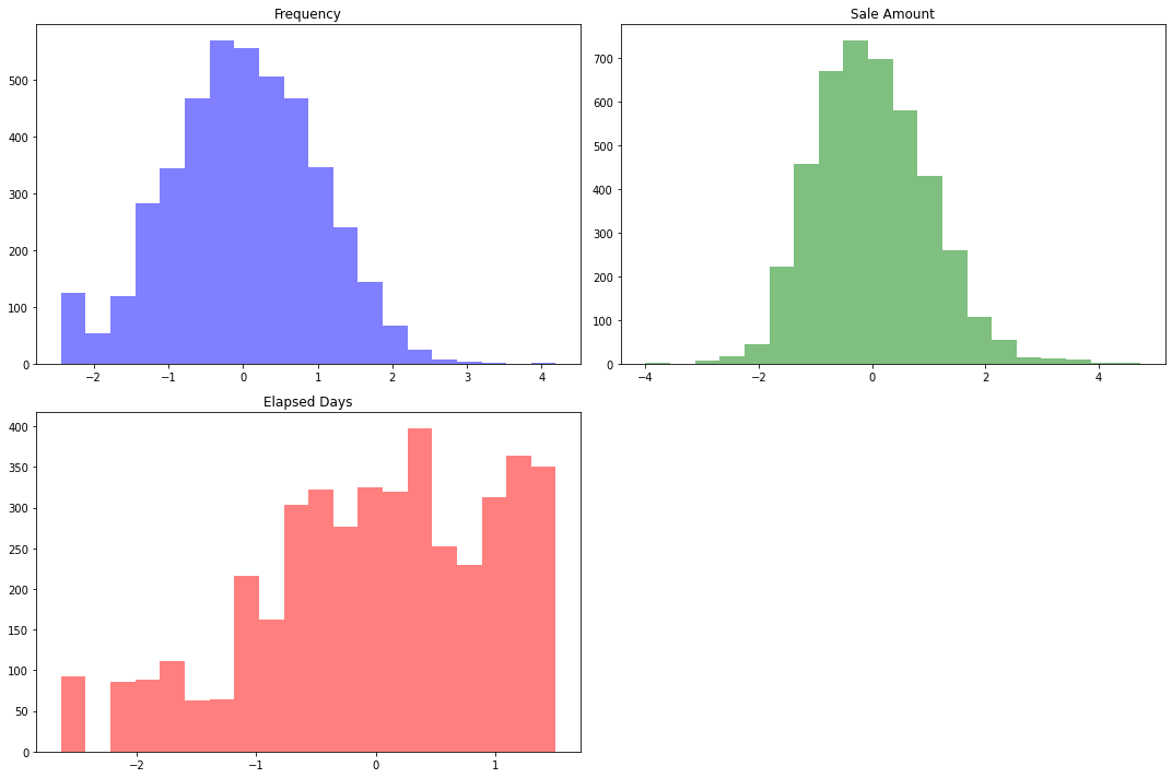
The x-axis represents the range of values (in our case, the standardized values of frequency, sales amount, and elapsed days), and the y-axis represents the number of occurrences (the count of instances in each bin of values).
Frequency: If the peak is around 0 and the highest count (on the y-axis) is 500, that means there are about 500 customers who have made purchases around the average number of times (recall that we standardized the data, so 0 represents the mean).
Sales Amount: The peak is around 0 as well, meaning that the majority of customers have made purchases totaling an amount close to the average total purchase amount.
Elapsed Days: This distribution seems a bit different from the others. Instead of one peak, it has several peaks (local maxima). This suggests that there might be distinct groups within the customers differing by their most recent purchase date. Consider this example:
The peak at 0.2 might represent customers who have recently made purchases. These could be the frequent customers who shop regularly.
The peak at -0.5 might represent customers who haven't made a purchase for quite some time. Maybe they're less frequent shoppers or have just started shopping less recently for some reason.
The peak at 1 might represent another group of customers who made purchases quite a while ago. They could be customers who only shop occasionally or who have churned (stopped shopping with us).
These are just hypotheses at this stage. The purpose of the K-means clustering algorithm will be to identify such groups more precisely based on all the variables (frequency, sales amount, and elapsed days) together.
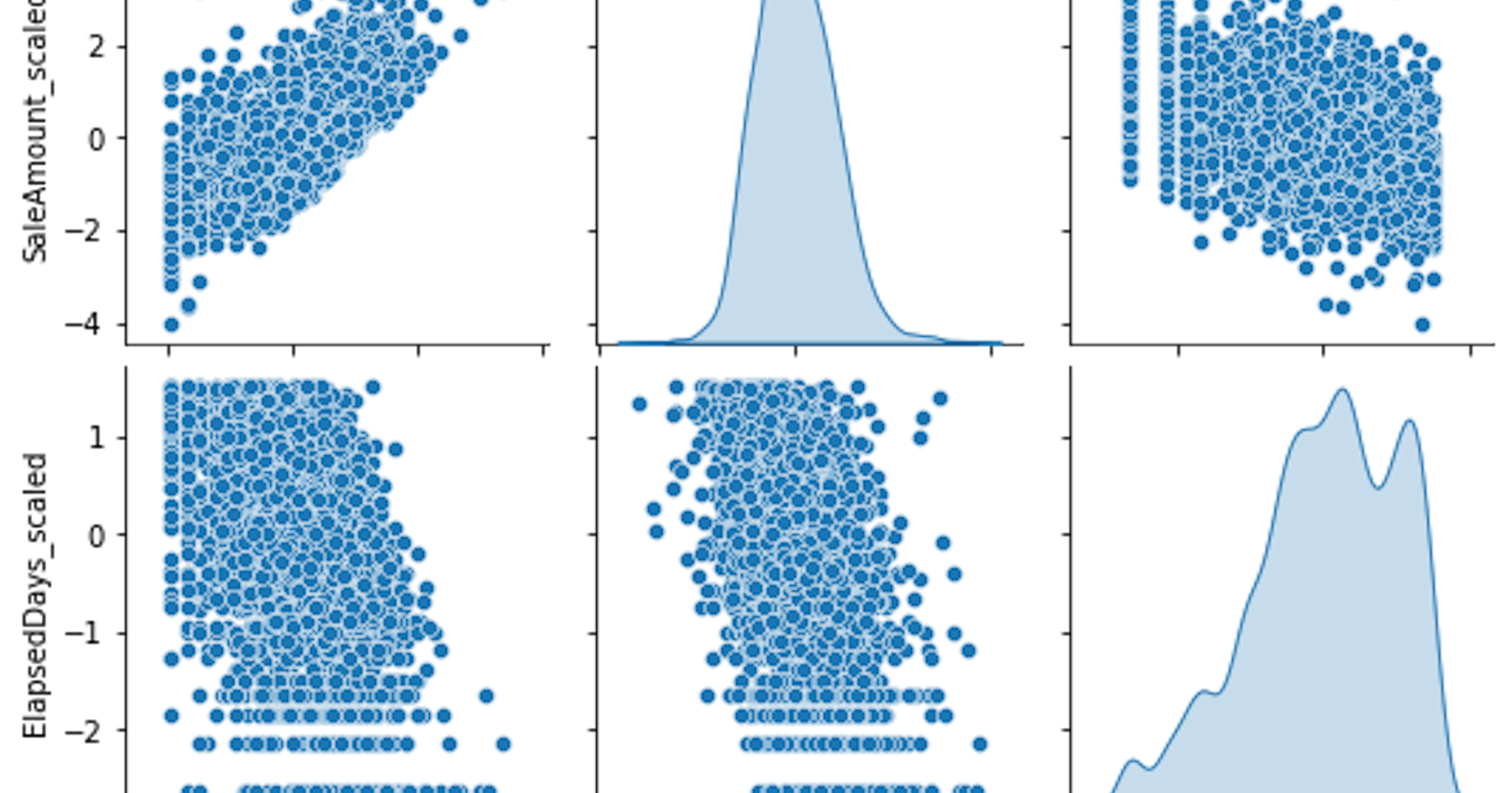
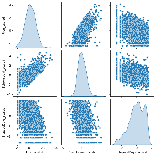
Next, let's consider scatter plots. Scatter plots allow us to visualize relationships between two variables. Since we have three features, we could look at the pairwise relationships between each pair of features:
# Importing the necessary library
import seaborn as sns

# Pairplot to visualize the relationship between features
sns.pairplot(customer_df[['Freq_scaled', 'SaleAmount_scaled', 'ElapsedDays_scaled']], diag_kind='kde')
plt.show()
Out:
The positive slope in the
FreqvsSaleAmountplot shows that customers who buy more frequently tend to have higher total sales, which makes sense intuitively.The pair plots
FreqvsElapsedDaysandSaleAmountvsElapsedDaysare showing a scatter without a clear linear trend. This could indicate that the recency of purchase doesn't have a strong direct relationship with frequency or total sales.It is also correct that the
ElapsedDaysvsFreqandElapsedDaysvsSaleAmountplots do not show a strong linear relationship either.
The reason we're not seeing a strong correlation in some of these plots is that customer behavior can be complex and not necessarily linear or easily predictable. That's part of why we're using a clustering algorithm, to uncover any underlying patterns that might not be obvious from simple plots.
These plots give us a sense of the distributions of the transformed features and their pairwise relationships, but we don't always expect (or want) all of our variables to be strongly correlated with each other in machine learning. If all the variables were perfectly correlated, they would all be telling us the same thing, and we wouldn't need all of them.
The next step is to use the K-means clustering algorithm on this data to see if it can identify any distinct groups of customers based on these three features. This can provide more insights into the customer base and their purchasing behaviors.